
Overview
Yako Yoga is an online yoga studio started by an independent instructor. She needed a digital presence to attract students, manage bookings, and organize classes. Previously:
- Information was shared informally across social media and messaging apps
- Students struggled to schedule classes easily
- The instructor had no simple way to manage or update classes
Solution: I designed a responsive website and admin dashboard prototype where users can view class schedules, book sessions, and contact the studio, while the instructor can add, edit, and manage classes in one place.
Bookings
Centralized online scheduling
Accessibility
Mobile & desktop responsive
Management
Instructor dashboard for classes

Role
UI/UX Designer & Brand Designer
Product Strategy, User Research, Interaction, Visual Design, Prototyping & Testing, Logo Design, Colour Palette & Branding
Problem
Before the website : bookings and updates lived in DMs and Whatsapp texts - no single source of truth.
Student Challenges
- Students had to DM or text to confirm a class
- Cancellations and updates were often miscommunicated
- Information was shared informally across social media and messaging apps
Instructor Challenges
- No independence in updating or managing the class schedule
- Lost bookings and wasted time due to fragmented workflows
- Inconsistent communication with students

These challenges highlighted the need for a responsive platform that could centralize class bookings, improve communication, and give the instructor full control of schedules.
Research & Insights
I worked directly with the instructor to understand both student and business needs.
Key insights:
- Students wanted clarity, simplicity, and mobile-first booking.
- The instructor wanted control of her own schedule with no coding required.
From this, I prioritised:
- Schedule + Booking flow → reduce friction for students.
- Admin Dashboard → independence for instructor.
- Responsive design → accessible across devices.

Affinity diagram: Research findings clustered into student needs and instructor needs.
Ideation and Process
I mapped the website architecture to answer a guiding question: “What’s the simplest way for students to book a yoga class, and for the instructor to manage her schedule?”
Key Design Decisions:
- Clear CTA (“Book a Class”) on homepage hero section → ensures easy access to booking.
- Dedicated schedule page with a clean calendar view → gives students clarity on class times.
- Simple booking form → allows users to complete the process in under 2 minutes.
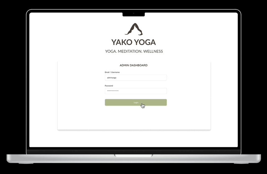
- Instructor dashboard with CRUD system → enables the instructor to add, edit, and manage classes independently.
Early wireframes showing the structure of the website. Slide left or right to view all the key screens.


User flow diagram showing how students and the instructor navigate the system.


These wireframes and user flows helped validate the structure and overall journey, giving students and the instructor a way to test the flow early and provide feedback before moving into high-fidelity design.
Validation (Wireframe Testing)
I tested the Yako Yoga wireframes with the instructor and two students. The testing revealed two key improvements:
- Schedule screen → students wanted the ability to view all available classes in one place before making a booking, so I added a dedicated schedule page with a clear calendar layout.
- Mobile-first layout → students mostly use their phones to book and attend classes, so the design had to work smoothly across both mobile and desktop.
- Booking confirmation → testers requested a simple confirmation message after booking to provide reassurance and reduce confusion.

These insights shaped the next iteration before moving into branding and high-fidelity designs.
Branding
After testing the core flows, the next step was to bring the brand to life visually before moving into high-fidelity designs.
I used AI-generated mockups to explore how the identity could extend beyond screens.
This ensured the brand felt cohesive, modern, and aligned with wellness culture.

- Colours: Calming palette of sage green, earthy brown, and soft white to reinforce wellness.
- Logo: Inspired by the downward-facing dog pose; a minimal, modern mark that anchors the brand.
- Typography: Balances clarity and warmth with clean headings and softer body text.
- UI Components: Reusable elements maintain consistency and reduce friction, making the platform intuitive for both students and instructors.

High-Fidelity Designs
High-fidelity designs that translated the validated Yako Yoga wireframes into a polished, wellness-inspired visual system.

Test Prototype
Explore the interactive Yako Yoga prototype below, or open it in Figma.
Impact
Clarity
Students saw all classes upfront
Efficiency
Easy to use booking form
Independence
Instructor managed schedule without coding
- Students appreciated the dedicated Schedule page for clarity before booking.
- Mobile-first layouts made the site usable across devices.
- The simple booking form reduced friction and errors.
- The instructor’s dashboard prototype gave her full control over adding, editing, and deleting classes.
Learnings
What worked
- Consistent, calming brand system (logo, colors, typography)
- Dedicated schedule screen improved clarity for students
- Simple booking flow encouraged quick adoption
Challenges
- Balancing simplicity with future scalability
- Designing for both students and instructor needs in one system
Next Steps
- Develop functional prototype into a working product
- Explore class cancellation flow for students
- Integrate with payment systems for bookings
- Refine mobile-first experience through more usability testing