Overview
Grace Kingdom Community Centre (GKCC) is a community church in Pretoria where I volunteer in the IT & Media department. The Media Ministry runs livestreams, sound, and projection every Sunday, but behind the scenes, operations were messy:
- Requests lived in scattered WhatsApp chats.
- Attendance was tracked on paper (if at all).
- Equipment status wasn’t recorded until something broke
- Weekly reports were inconsistent.
Solution : I designed and developed a centralized admin system that streamlined reporting, attendance, equipment tracking, and media requests — reducing coordination time, increasing report consistency, and giving leaders visibility into operations.
Coordination time
≈ 25% reduction
Consistency
↑ weekly report submissions
Visibility
Centralized admin system
Role
UI/UX Designer & Developer
User Research, Wireframing, Visual Design, Frontend & Backend development and Usability Testing.
Problem
The challenges at GKCC Media Ministry affected both user experience (volunteers and leaders) and operational efficiency.
Volunteer Challenges
- No single source of truth for media requests, reports, and attendance
- Equipment failures went unnoticed until they caused disruptions.
- Manual, scattered processes (WhatsApp, paper) led to delays and miscommunication.
Ministry Challenges
- Leaders lacked reliable data to guide decisions or plan ahead.
- Coordination effort reduced focus on creative/spiritual work
- Fragmented workflows weakened accountability and transparency

These challenges highlighted the need for a more structured system that could reduce stress , improve coordination and ensure the service runs smoothly without avoidable disruptions.
Research & Insights
I conducted informal interviews with ministry leaders and volunteers to map out their workflows.
Key insights:
- Leaders needed weekly reports to make better decisions.
- Volunteers wanted a simple, single place to log attendance and requests.
- Everyone agreed that equipment tracking would reduce last-minute crises.
This shaped the four core features:
- Weekly Reports
- Attendance Tracking
- Equipment Status
- Media Requests

Affinity diagram : Research findings clustered into four key needs: weekly reports, attendance tracking, equipment status, and media requests.
Ideation and Process
I began by sketching user flows and wireframes to answer a guiding question: “What’s the simplest way for volunteers to log information right after a service?”
Key Design Decisions:
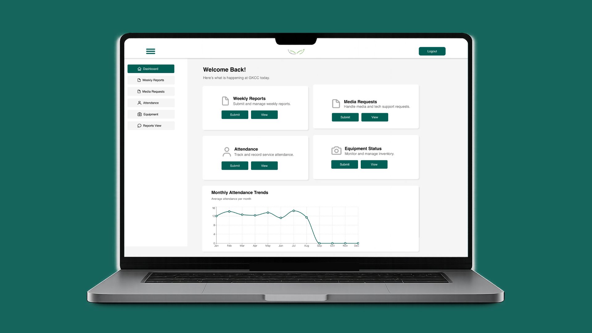
- Dashboard with 4 feature cards (Weekly Reports, Attendance, Equipment, Media Requests) → a simple mental model for navigation.
- Attendance with line graph → allows leaders to view weekly trends at a glance.
- Equipment with Add + Update cards → volunteers can log new equipment or update existing items easily.
- Inventory list in Equipment → dynamically displays all equipment and conditions, so issues are visible early.
- Reports View page → central space where leaders can access both weekly reports and media requests once submitted.
Early wireframes showing the structure of the system. Slide left or right to view all the key screens.
User flow diagram showing how volunteers and leaders navigate the system.

These wireframes and user flows helped validate the structure and overall journey, giving volunteers and leaders a way to test the flow early and provide feedback before moving into high-fidelity design
Validation (Wireframe Testing)
I tested the wireframes with 3 volunteers and the Media leader. The testing revealed two important improvements:
- Equipment summary card → the leader wanted a quick way to see equipment status at a glance, so I added a summary card.
- Editable Reports View page → leaders needed the ability to add comments and mark requests as approved, in progress, or needs follow-up. This supported accountability and transparent decision-making.
These insights shaped the next iteration before moving into high-fidelity designs.
Visual Design
Visual design aligns to GKCC branding: deep greens, soft grays, and white ; spacious cards with rounded corners; centered titles and supportive subtitles.
Colours
Typography
Helvetica
Components
Card layouts, concise forms, simple graphs, toast alerts.
High-Fidelity Designs
High-fidelity designs that translate the validated wireframes into GKCC’s visual system.
Slide to view all screens.
Usability feedback on hi‑fi prototypes:
• Volunteers preferred having confirmation messages (toast notifications) after submissions.
• The Equipment summary card was highly valued for quick updates.
This iterative process ensured the final system was aligned with real needs, not just assumptions.
Development
I developed the system end-to-end, translating the validated designs into a functional product.
- Frontend: React (JSX), TailwindCSS
- Backend: Express.js, Prisma, PostgreSQL
- Deployment: Render (backend), Netlify (frontend)
- Testing: CRUD routes validated on Postman, responsive layouts tested
Impact
Coordination time
≈ 25% reduction
Report consistency
Improved submissions
Visibility
Single source of truth
- Reports became consistent week-to-week.
- Equipment issues could be logged and tracked early.
- Volunteers felt less stressed on Sundays, knowing everything lived in one place.
- Laid groundwork to expand to other ministries.
Learnings
What worked
- Consistent UI that aligned with GKCC's existing visual identity
- Simple, direct flows with minimal fields
- Card‑based layout improved scannability
Challenges
- Balancing volunteer time with scope
- First‑time PostgreSQL learning curve
- Iterative refactors from feedback
Next Steps
- Mobile‑first optimization
- Expand to other departments (Ushering , Music , Reception)
- Integrations with communication tools (email/SMS)


